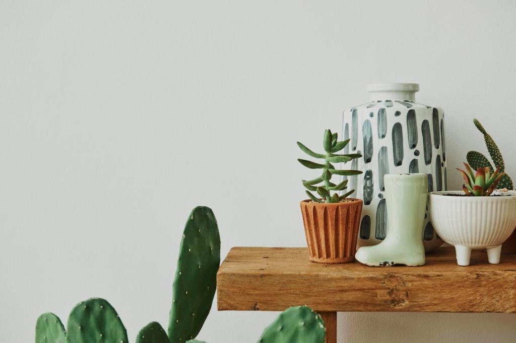


A Real‑World Makeover: From Harsh White to Harmonious Nature
Maya’s rental felt cold: glossy white walls, plastic blinds, echoing floors. She wanted warmth without waste. Her goal was clear—use eco‑friendly color palettes and textures to soften light, dampen noise, and make evenings feel like exhaling after a long city day.
A Real‑World Makeover: From Harsh White to Harmonious Nature
She sampled mineral‑based, low‑VOC paints in sage and river stone, then limewashed the bedroom. A thrifted jute rug grounded the living area, while reclaimed shelves oiled with linseed brought grain to life. The palette read as hush, not hush‑hush sustainability signaling.